“Color is a means of exerting direct influence on the soul. The color is a key, the eye the gavel that strikes it, the soul the instrument with a thousand strings,” said Wassily Kandinsky, a well-known Russian painter.
Did you know that colors do not actually exist?
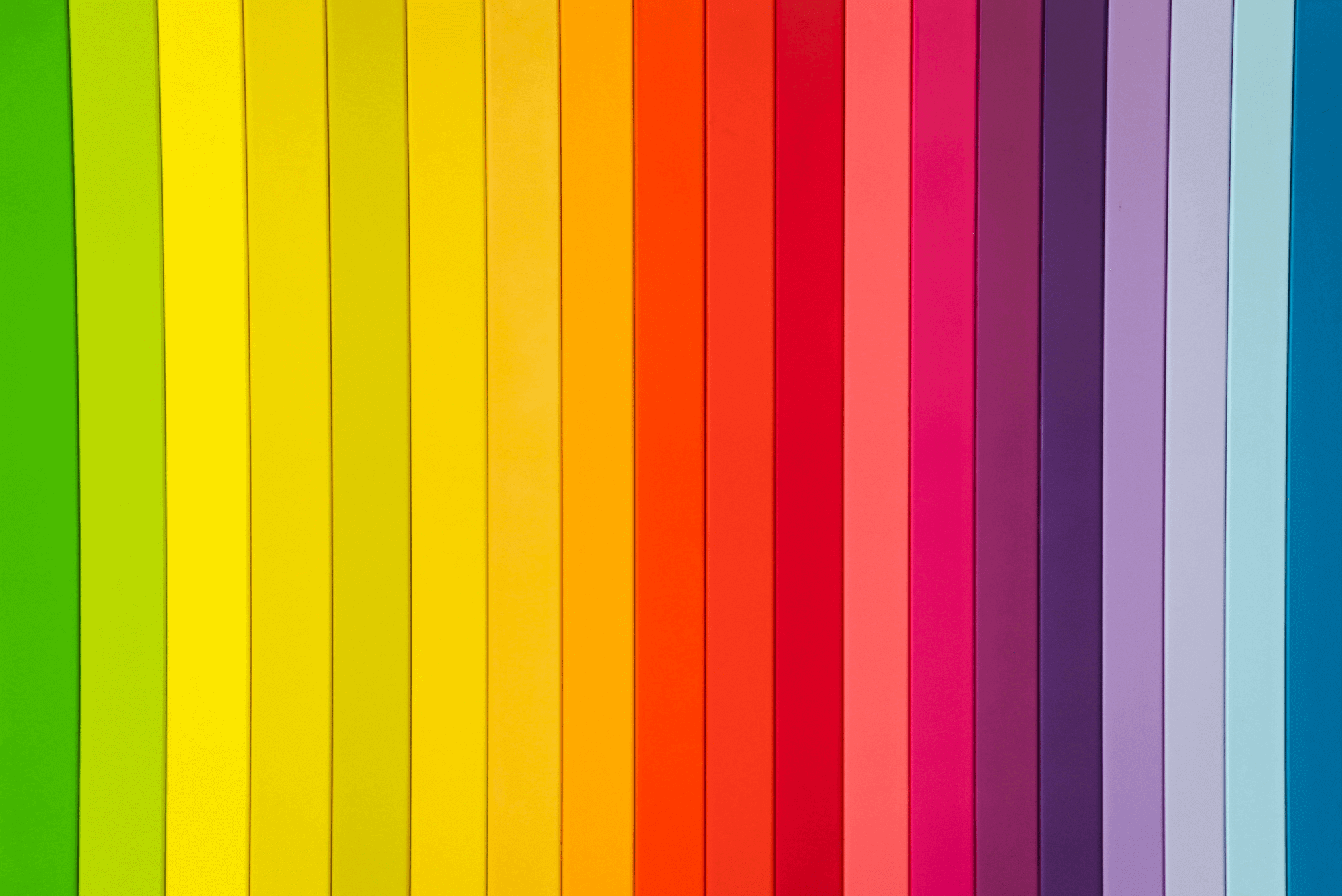
Ch.1: colors do not exist
In reality, the range of colors we perceive is the result of wavelengths that stimulate special receptors in our eyes, known as cones and rods. The reason we can say that colors do not exist stems from the fact that these receptors, among the different bands that make up the magnetic spectrum, respond only to some of them, contained in an interval called the “visible spectrum.” The truth is that colors are a reprocessing of information received from the reflection of light.
Have you ever wondered why we do not see colors at night? Well the answer lies in this very explanation, for in the absence of light there is no reflection and therefore we see objects by their actual hue.
Hue exists because the human brain can process its essence. We can deduce then that black and white are not colors, but are more simply a representation of absolute absorption and reflection. In fact, if an object absorbs all wavelengths of light incident on it, it will be black. Conversely, if an object reflects all of the incident wavelengths, it will appear white to our eyes.
Having now explained, the real nature of colors, let us go on to analyze the influence they have on people.

Ch.2: the psychology of color
Color psychology is a study of analyzing in detail the effect of human perception and behavior of color. Not only feelings but also many actions of human beings are influenced by color. To get into the specifics of our field, color is the determinant that can make a user keep visiting our website. The correct use of color can drive the user to purchase one of our products or improve the usability of a platform.
In fact, according to one study, between 62-90% of consumers’ initial impression is based on color choices alone, which is precisely why color choices play a central role in creating a successful website and/or brand.
Confirming this, another study conducted by Google, tells us that it takes less than 50 milliseconds for a user to form an opinion about a website. After only 0.05 seconds, the average user has already decided whether to continue browsing a site or leave the session and return to the search results. A user’s first impression of a website depends on several factors, including without a doubt, the colors and color combinations used on the page.
For my digital product then what color do I use?
Ch.3: the use of colors on the web
Different companies and products choose different colors to identify their brand. But why?
Color, as mentioned above, is not only an efficient way to capture the attention of your potential customers and consumers, but it is a way to communicate with them on an emotional, almost subconscious level.
Within a website or app we can identify, most often, a neutral color background such as black, white or beige for example, while brighter colors are usually used for the components of a page. We should also point out, however, that recent trends emphasize that within the economy of a web page or app, neutral colors are increasingly obtaining a dominant character.
In fact, in this case, their function is equivalent to that of the famous white space, that is, they serve to hierarchize text, to prioritize content, or to allow the user to take a break from long paragraphs of text.
As we will see in the next chapter, neutral colors are often used by brands that focus on progress, new technologies, and high quality.
Moving on, we can identify warm colors such as red, orange and yellow that express a strong character, attracting the user’s attention and being especially used on specific components such as buttons and CTAs (Call To Action). Be careful, however, not to abuse the use of these hues within a single screen, as they will tend to lose their positive connotation evoking opposite feelings such as heaviness and/or aggressiveness.
Shades of green and blue, on the other hand, create a calming effect on the human being. Blue, conveys loyalty and security and in fact is very present in banking or insurance websites and apps.
Small digression: had you ever noticed the color of the walls of the operating room and the color of the doctors’ scrubs inside? They are green. The choice is not aesthetic, but extremely functional. In fact, the color green is considered an expression of relaxation, of relaxation, and being complementary to the color red, when stained by blood it will be barely visible to our sight.
The perception of a color also depends on which shade of it is used. For example, softer shades cannot be used to attract users’ attention, however, they can help convey a sense of harmony and balance.
Let us now look at the main characteristics of each color and the various applications.

Ch.4: the meaning of colors
The Western world, as a consequence of both evolutionary processes and our cultural background, has associated ideas and emotions with primary colors.
Here is a more specific analysis of them below:
- Red: It is definitely the most vibrant and stimulating color in the spectrum. It is the first color we notice, as it is capable of attracting our attention, just think of the famous “code red” much used in movies. It expresses a sense of urgency. It has been shown by studies that the average user tends to spend and buy more quickly, almost impulsively when there is the presence of this color.
Red, however, should be used with balance and conscientiousness. In fact, this particular color is used with negative connotation to signal even danger or an unpleasant situation. Often used in the restaurant and food industry, it is discouraged for economic-financial areas. A practical example could be a menu or a form, that is, all those elements that allow the user to interact with a layout by generating an experience.
Brands: Coca Cola, KFC, Kellogg’s, Virgin, Netflix.
- Blue: Blue, without a shadow of a doubt, is the most widely used color on the web. This color conveys relaxing and positive feelings, conveying well-being, tranquility and peace. Just think of the contrast between fire (red) and water (blue). In its light shades, above all, it inspires confidence and helps with calm, rational reflection.
Being a positive color that conveys trust and confidence there are few situations in which it is preferable not to use it. Reliability and solidity are two strengths of this color, but it is probably not advisable for eye-catching projects that want to make an impact visually, as it comes across as a serious and almost detached shade.
Brands: Dell, American Express, Facebook, Twitter, Volkswagen. - Yellow: Yellow like orange conveys energy. It is a color that stimulates creativity and that from the earliest years of our lives we begin to know through drawings as the color of the sun.
A little curiosity: the color yellow being an attention-grabbing color is mistakenly associated with the creation of post-its. In reality it was not a conscious choice, rather the creator of post-it notes, Spenser Silver, having to carry out tests and needing paper used the only sheets of paper left in stock, precisely yellow in color.
It is used in the creative and technological field and is therefore recommended for a particular and creative layout of a website or app. It has also been shown that if you need a color combination to make people read clearly and remember more easily, it is advisable to use black on a yellow background.
Not recommended, on the other hand, if you want to communicate elegance and professionalism as it is a very youthful color.
Brands: UPS, Nikon, National Geographic, Ikea, McDonald’s.
- Green: Green can be identified as the most relaxing color in the spectrum. Pleasant and reassuring it is associated with hope, health and nature and in fact we can find it on portals dedicated to the animal and natural world. Delving deeper into color analysis, we can point out that in its darker shades it inspires confidence and in fact is often exploited by legal or financial companies.
In contrast, great care must be taken with its lighter hues as a bright green is often associated with youth and immaturity and therefore not recommended for those who want to convey a sense of reliability and security instead.
Brands: Spotify, Android, Holiday Inn, Starbucks, Animal Planet.
- Purple: Often dedicated on the web to a purely feminine audience, purple comes from combining the restraint of blue with the passion of red. Since ancient times it has been associated with nobility and royalty because of its extreme elegance. To this day, on the other hand, we can find it often juxtaposed with the world of religion and spirituality.
In the web sphere it is exploited by companies that engage in the sale of personal care products, such as perfumes, cosmetics and underwear. As with yellow, it is a color loved by children and therefore ties in well with the sale of children’s items.
Brands: Milka, Taco Bell, Syfy, Wycon.
- Gray: Gray is a formal, solemn yet reliable and elegant color. Being a color that conveys composure and seriousness, it is used a lot by automotive and technology brands. Juxtaposed with white and black it offers a clear and clean design.
Linked to the concept of wisdom and experience it is easily exploited by those who want to focus on their stability and prestige in order to gain the esteem and trust of their consumers.
Brands: Apple, Wikipedia, Mercedes, Audi.

Ch.5: buttons and CTAs
Based on everything I have previously explained to you therefore, all users, inevitably, are influenced by the colors used within a web page or app and act according to the unconscious associations they provoke. Fundamental then is the choice of a correct color for a CTA (Call To Action) button in order to improve conversion rate.
Conversion rate, in Italian conversion rate, is the percentage of unique visitors who performed the specific action that the advertiser has defined to be the goal of creating the web page (source: wikipedia). To be more clear, specific action means, for example, signing up for a newsletter or purchasing a product, which would result as a positive response to the aforementioned CTA and thus would allow the calculation is the percentage of unique visitors.
A call-to-action button consists of five elements, which, at best, should coexist in harmony with each other and with the site design:
- Shape;
- Dimensions;
- Button text;
- Position;
- Color;
All of these elements influence conversion rate, but several studies, however, have shown that it is color that plays a central role in improving KPIs (Key Performance Indicators). In a study conducted by Maxymiser, for example, a company was able to increase clicks to checkout by 11 percent just by changing the colors of its web page.
Better conversion rates come from using warm colors such as precisely red, orange and yellow.
The use of green should also not be underestimated. In our culture, in fact, green is associated with the color of the traffic light, which represents a sort of “green light” and therefore leads the consumer to evaluate the click as a correct choice.
Finally, to be avoided for buttons and CTAs, dark colors (see black and/or brown), which have a very low conversion rate.
Once I have chosen my primary color, how can I create a complete palette?
Ch.6: color palettes
The color details of a web app for example, must be chosen according to the main color.
To make proper color palettes, there are tools that allow you to identify the secondary color (two at most). Here are some of them below:
Ch.7: Conclusion
“Simple color, can speak to the soul in a thousand different ways.”
This quote by Oscar Wilde perfectly explains what our ultimate goal should be. Through the wise use of colors, we have the possibility, indeed the duty, to create a deeper connection with our user, opting for consistent choices in order to favor the navigation of our website or app and thus to propose a correct usability.
What colors have you chosen for your website or app?